


-
The Watchmen. We are more or less what our name suggests. We keep our eyes wide open just to make sure the brands we watch over never sleeps its way out of the market. Who are we? Just a bunch of advertising professionals (if we could be called so) whose passion for the craft made us think beyond cubicles, coffee machines, corner offices and 9-5 routines. The truth is, we even occupy the smallest workplace on earth. It's called the human brain. Our working principle too is in fact quite basic. Most start thinking outside the box. On the contrary, we start from right within it. Because, from what we've learnt over the years, we may have to dig deep into the business to find answers.
-
BRAND IDENTITY
BRAND
IDENTITY
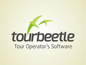
Client: Sookshmatech Solutions Private Limited, Technopark, Trivandrum.
Vertical : Computer Software Solutions
Problem: This tour operator's software had been widely used in the business for years. As they felt the product logo lacked identity and clarity on what it needed to commicate, they had approached us for a total rebranding.
Symbology: We used the tern bird, a gull species which is supposed to be a bird that travels the most.
Typography: Lower case to represent Youthfulness. The italic was used to represent movement.
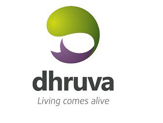
Client: Dhruva
Vertical : Real Estate Developers
Concept: Why simply live your life through when you can make it come alive? We see Dhruva as a place where the idea of living gets an all new dimension. Every other Builder sells concrete structures. We saw the brand as one that has to be about living spaces that make every moment of life come life.
Symbology: The Visual identity or the logo has got a very clear element of life in it. It represents the alphabet "D"
Typography: The name is written in small case, which show the youthfulness of the brand. The Typography used is simple,elegant and highly legible.
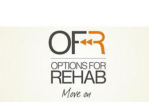
Client : Options for Rehab, California
Vertical : Medical Service- Rehabilitation
Symbology : Logo unit was re-designed with the good old rewind button, The rewind button symbolise the concept of going to the beginning where it all started. The idea throws the limelight on what "Options for Rehab" can do to those who like to get back to normal life after rehabilitation. IT rewinds patient to original state where you lived normal life.
Symbology: The Visual identity or the logo has got a very clear element of life in it. It represents the alphabet "D"
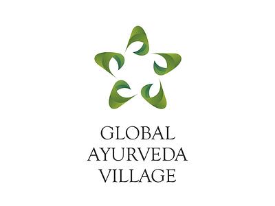
Client : Kerala Industrial Infrastructure Development Corporation (KINFRA), Government of Kerala
Assignment : Developing a logo unit for their Ayurvedic venture, The Global Ayurveda Village
Vertical : Government Infrastructure Development.
Symbology : Based around the concept of pancharkarma, which happens to be the pinnacle of ayurvedic life sciences.
-
CREATIVE COMMUNICATION
SP Fort Hospital Print Ad
1/
Vasan Eye CarePrint Ad
1/
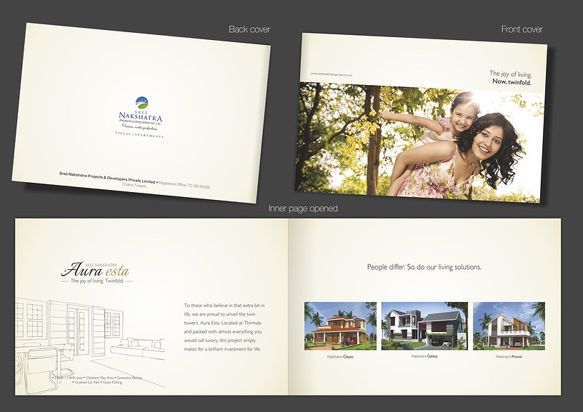
Sree Nakshatra Builders Brochure
1/
Sree Nakshatra BuildersLeaflet
1/
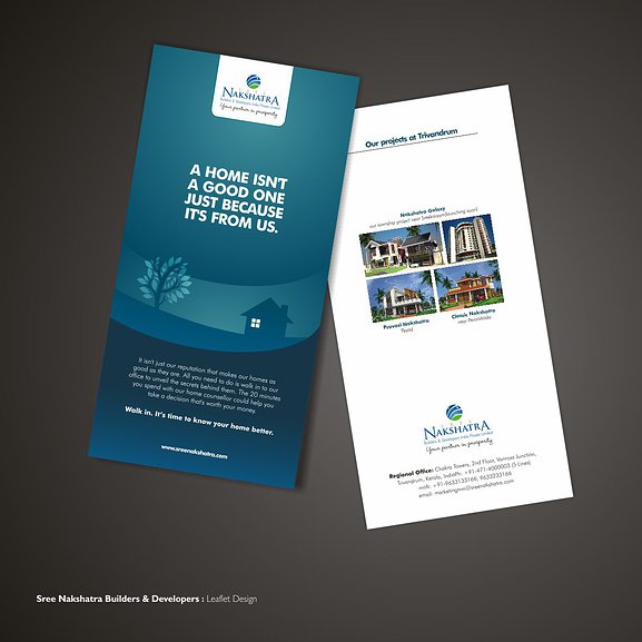
Sree Nakshatra Builders Leaflet
1/
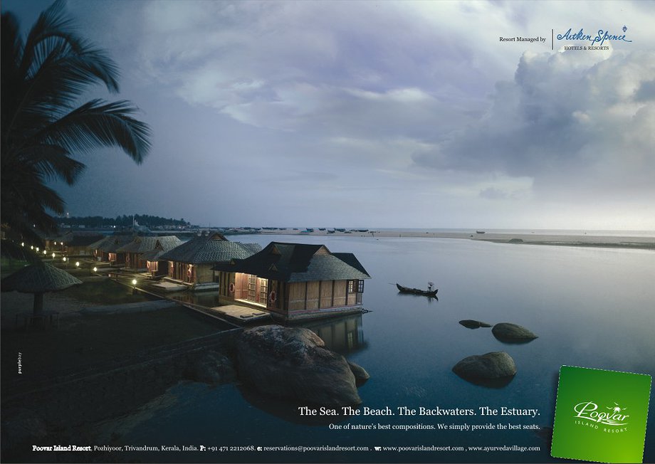
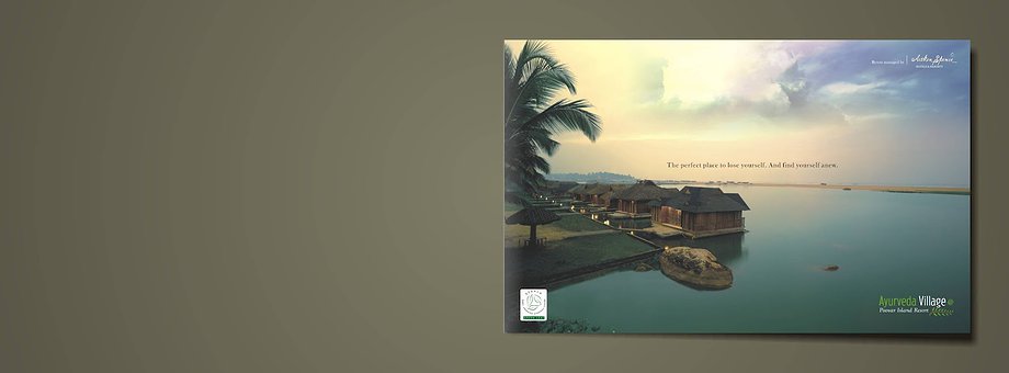
Poovar Island Resort Print Ad
1/
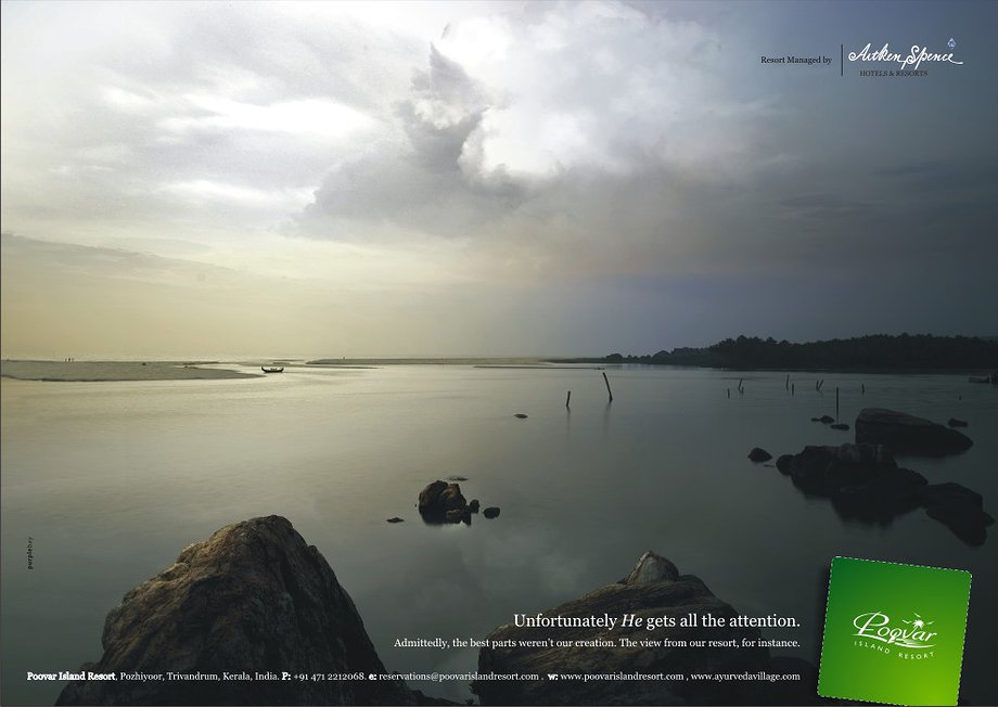
Poovar Island ResortPrint Ad
1/
Poovar Island Resort Brochure
1/
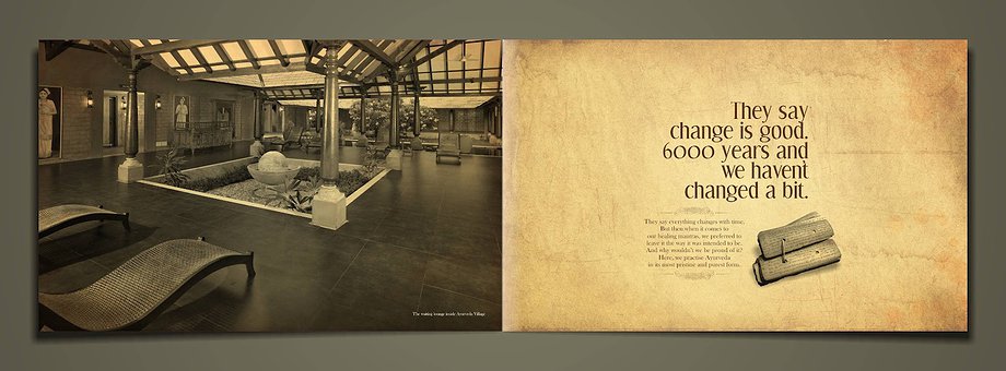
Poovar Island Resort Brochure Page 1
1/
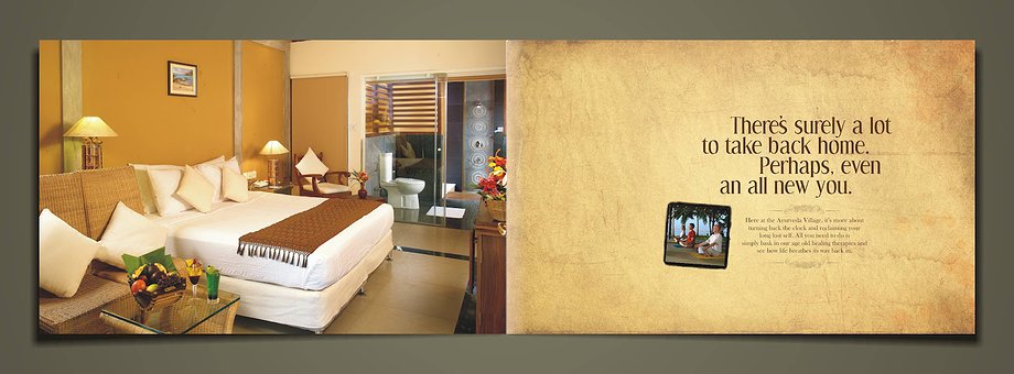
Poovar Island Resort Brochure Page 2
1/
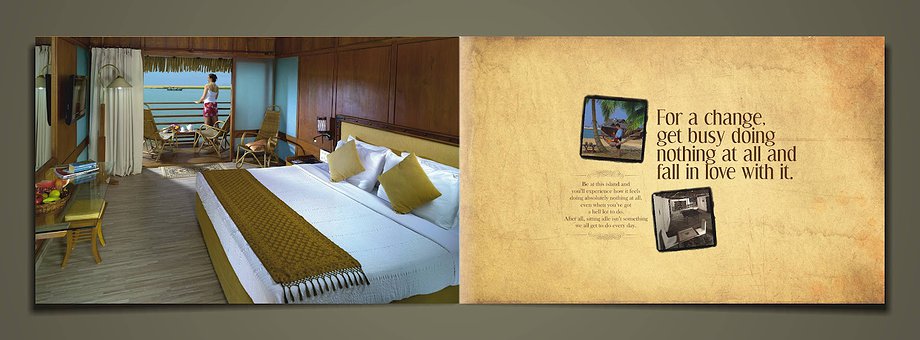
Poovar Island Resort Brochure Page 3
1/
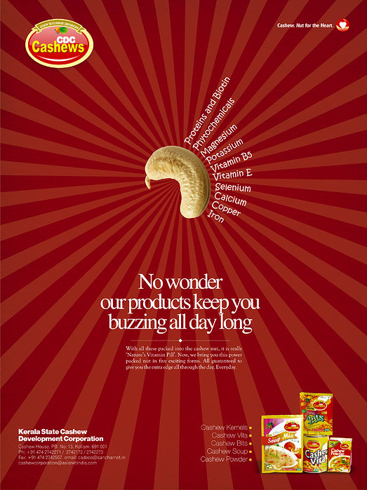
Kerala State Cashew Development CorpPrint Ad
1/
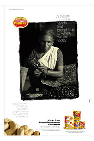
Kerala State Cashew Development Corp Print Ad
1/
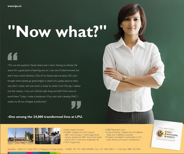
Lovely Professional UniversityPrint Ad
1/
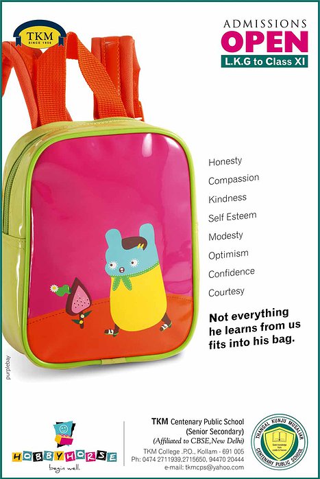
TKM School Print Ad
1/
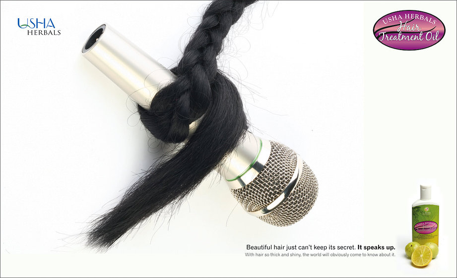
Usha Herbals Print Ad
1/
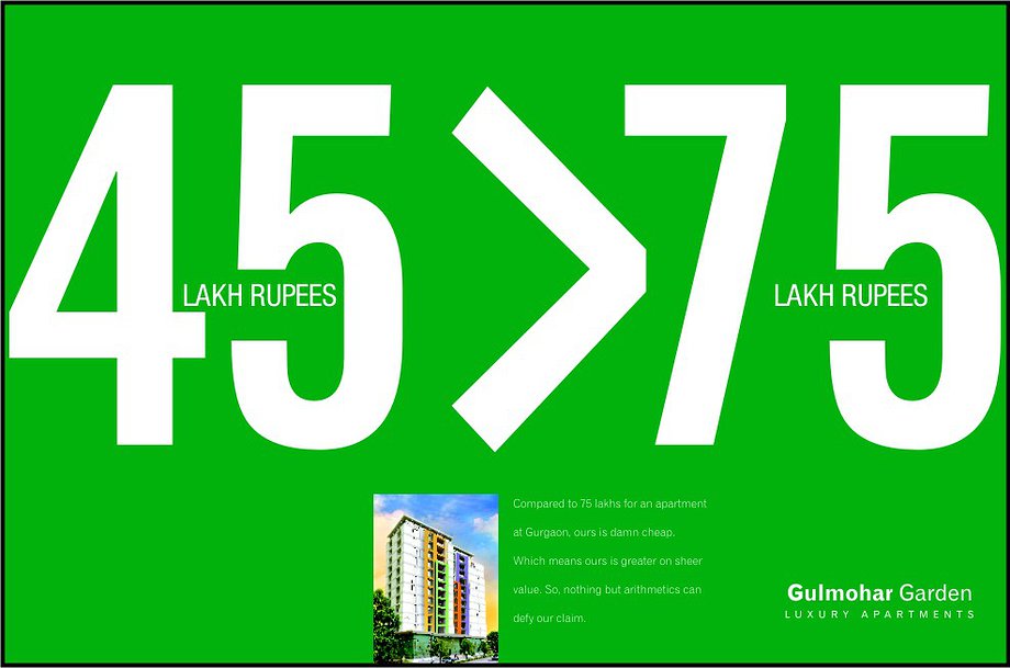
Gulmohar Builders Bill Board
1/
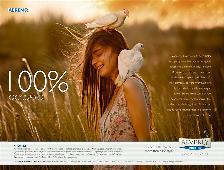
AEREN R Builders Print Ad
1/

Tejas JewelleryPrint Ad
1/

Tejas JewelleryPrint Ad
1/
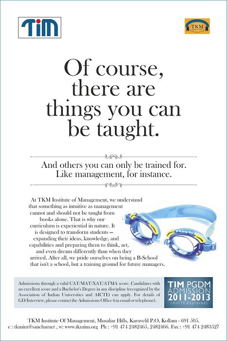
TKM Institute of ManagementPrint Ad
1/

Artech BuilderPrint Ad
1/
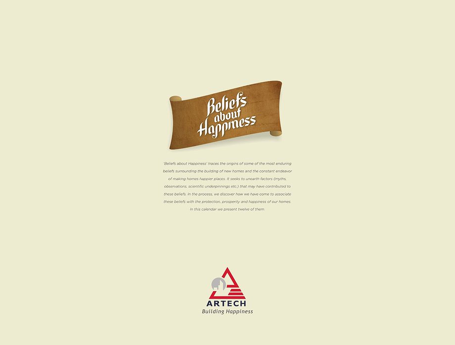
Artech 2013 CalendarIntro
1/

Artech 2013 CalendarIntro
1/
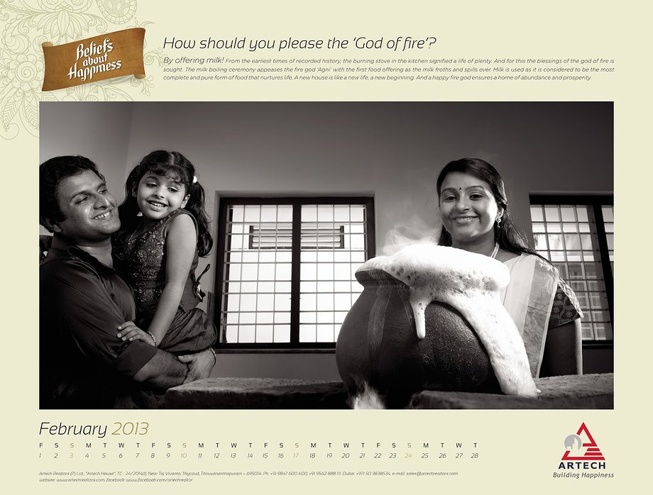
Artech 2013 CalendarIntro
1/
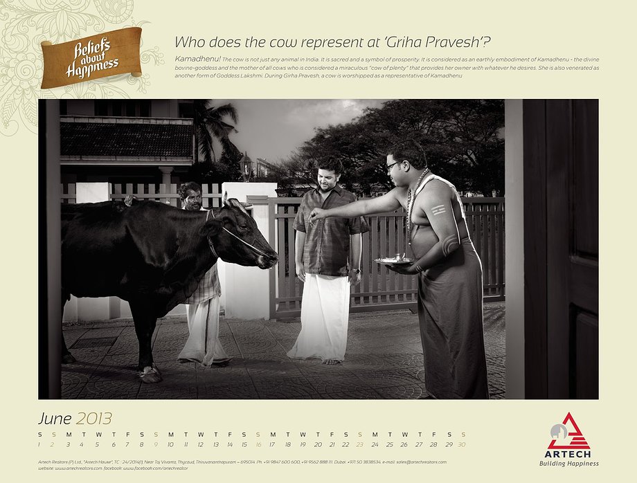
Artech 2013 CalendarIntro
1/
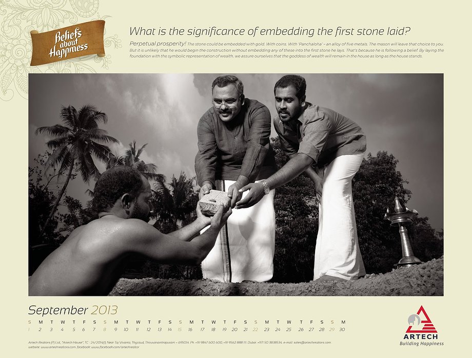
Artech 2013 CalendarIntro
1/


-

The fact is it works the other way around. We'll
get back to you.All you need to do is shoot us a mail at
info@abysparadigm.com
with your contact address.